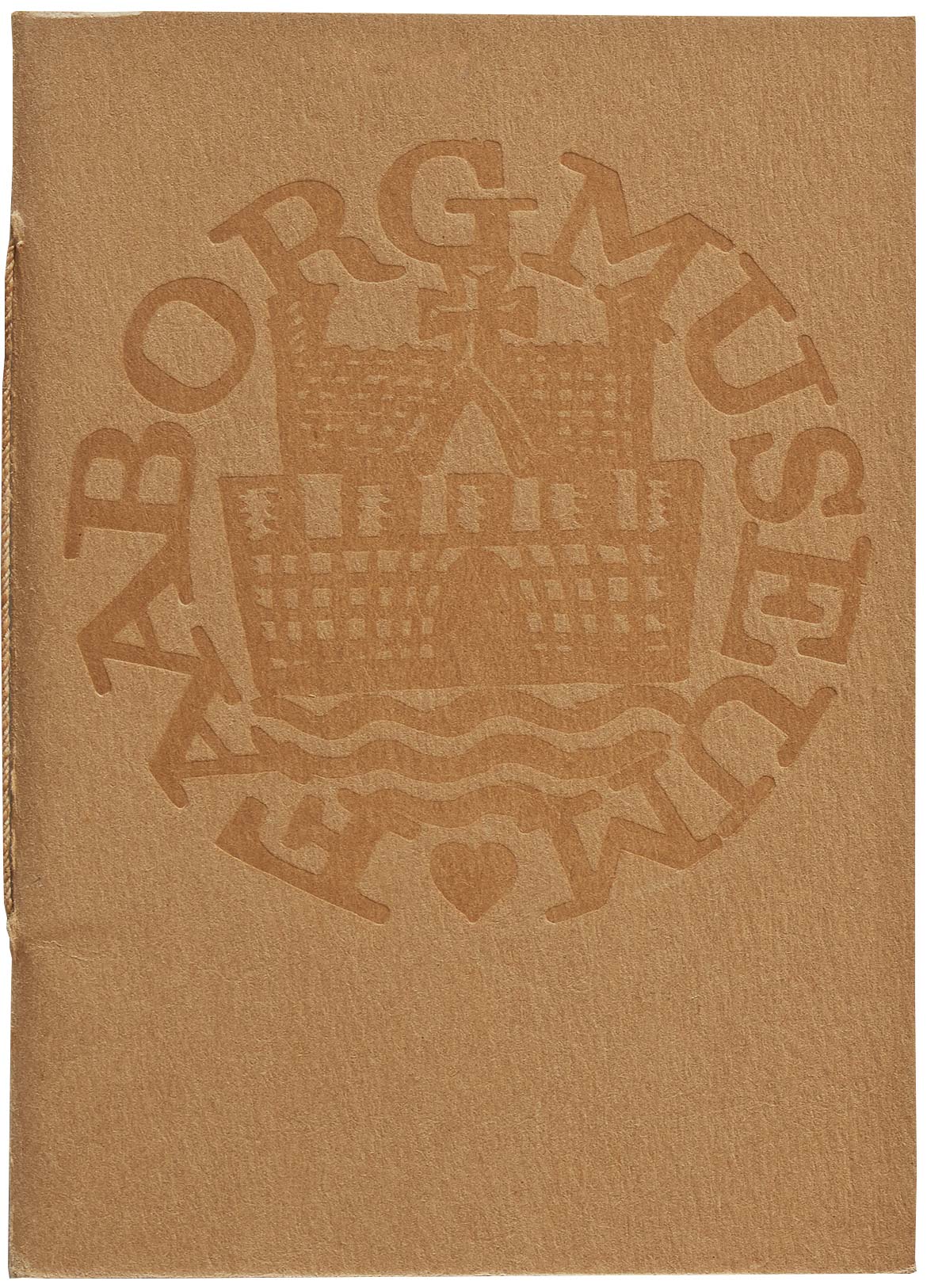
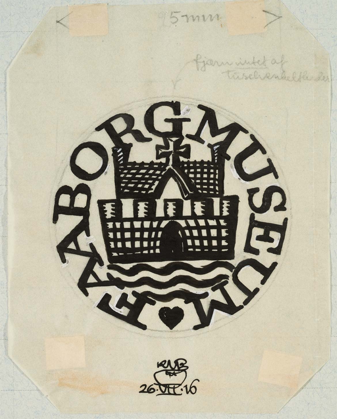
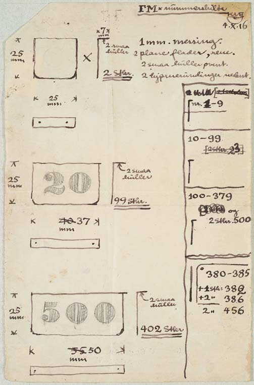
A vision lies behind every single detail at the Faaborg Museum. Carl Petersen himself designed the typeface for the Museum’s masthead. At the same time he realised the specific challenges presented when designing a typeface for captions to accompany the artwork. Therefore in May 1915 he commissioned the architect and graphic designer Knud V. Engelhardt to draw up the Museum’s graphic identity, namely its logo, catalogue and numbers for the paintings.
Form and Function
Carl Petersen and Knud V. Englehardt both wanted to break with a conventional decorative approach to design and architecture where one had to use the same formal elements across a range of materials and production processes. They imagined a context somewhere between form, function and production and, for example, let the choice of materials and their natural colours contribute to the overall design. Englehardt worked both in industrial product design such as flatware, stoves and similar objects, and also in graphic design such as signage, logos and company branding. He was very well-known for his designs for the former Copenhagen Tramways (1910), the logo for the Copenhagen company Georg Jensen’s Damask and the now ‘iconic’ street signs in the capital’s suburb Gentofte where his heart signature, which is also present in the Faaborg Museum’s logo, forms the dot over the ‘i’s.


